


Pen Worthy or Pass? 📄 Leuchtturm1917 Hardcover A5 Notebook
- Jul 30, 2025
- 8 min read
As I've been on the journey of notebook and paper exploration this past year, I thought it would be awesome to share my findings with my fellow enthusiasts and those who are looking into fountain pens as their primary writing instrument. I learned the hard way (as I suspect many of us in the fountain pen community did) that not all papers were created the same, so here I am, sharing my experiences with the different notebooks and papers I've been trying out so that you can make an informed decision before buying that notebook you've been eyeing for a while. Let's be real, some notebooks are incredibly expensive, especially if you're used to buying cheap ones from your local stationery or even grocery stores, so I think it's a great idea to learn about them before buying, just like we would when we're considering buying a cool gadget. Otherwise, we'd end up with a bunch of notebooks we don't use (oh, I know that experience quite well).
The first notebook I'm reviewing here is the Leuchtturm1917 Hardcover A5 Notebook. If you're a stationery enthusiast or a frequent customer at bookstores in general, you'll probably be familiar with Leuchtturm1917. With their clean design, a great selection of colors, and reputation for quality, these German-made notebooks have earned a loyal following among creatives, planners, and writers alike. But how do they perform if you write with fountain pens?
The Basics

This is the Leuchtturm1917 Hardcover Notebook in the color Olive (yes, it doesn't look quite olive green to me either). My preferred size for notebooks is A5 as I write A LOT, and I got this in my preferred ruling as well, which is dotted/dot grid. Here are some other features of this notebook:
251 pages, paginated
rounded corners
80 gsm, acid-free, chamois-colored paper
2 ribbon bookmarks
2-page table of contents
Gusseted pocket inside the back cover
Elastic closure
Archival labeling stickers
Thread-bound, lay-flat sewn binding
The regular price of this notebook in Thailand is 1,090 THB, which is around 33.5 USD at the time of writing. This breaks down to 4.34 THB/page or 8.72 THB per sheet (this goes into account when it comes to my ratings later on).
Fountain Pen Tests
The purpose of this review is mainly to see how fountain pen-friendly the notebook is. So while I'm not going to deep-dive into each feature that the notebook offers, I'll be testing the paper with various fountain pens with different applications.
Test 1: Fine and Medium Nibs
My go-to nib sizes on fountain pens are fine and extra fine, but I also occasionally use medium nib pens. So those are what I'm using in this test.

Pen & Ink Combos used
Platinum Century 3776 <F> + Aurora - Black
Lamy Safari <M> + Lamy - Black
TWSBI ECO <EF> + De Atramentis - Jane Austen (forgot to take a picture of this before I moved on to the next test)
Writing Experience
It was a pretty lovely writing experience. The paper in this notebook has a slightly toothy surface, meaning you can feel a bit of texture as you write.
The paper appears to be uncoated, or if it is, then it is only minimally coated. This means it's more absorbent and ink soaks in a little faster, which reduces smudging, though it increases ghosting and potentially makes shading/sheening inks less dramatic, but we'll get into that a little bit later. I personally love toothy paper for long writing sessions, as I love hearing the sound of the nib as it writes on the paper. That's not to say that this paper is THAT toothy, but if you're writing in a very quiet room, you'll likely hear the feedback if you're using certain pens.
Performance
Now, for the metrics that matter to fountain pen enthusiasts, here's how it performs so far with EF, F, and M nibs:
🪶 Feathering: No Feathering
🩸 Bleed-through: No bleed-through
👻 Ghosting: Moderate ghosting, might bother some people
Test 2: Stub Nib
I regularly use stub nib pens to write big headers, whether I'm journaling or taking notes for certain things. So I thought it would be a good idea to test them here, too.
Pen & Ink Combo Used
Kaweco Perkeo 1.9 mm stub nib + Wearingeul - The Picture of Dorian Gray


Writing Experience
Honestly, I was a bit afraid that the paper wouldn't be able to handle the stub nib. But I was pleasantly surprised at how well it did. Granted, this isn't a particularly wet-flowing ink, but I'm still impressed.
Performance
🪶 Feathering: No Feathering
🩸 Bleed-through: No bleed-through
👻 Ghosting: Moderate ghosting, might bother some people
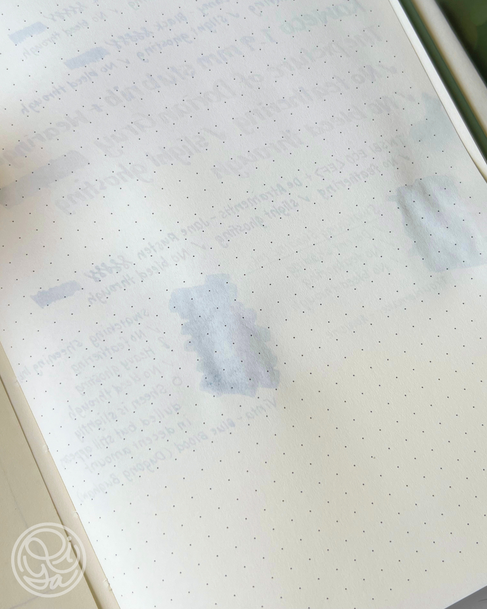
Test 3: Ink Swatching
Some people (like me) like to swatch inks in their notebooks. In fact, I have a whole notebook dedicated to journaling about my fountain pen ink collection. So I test-swatched a couple of inks in here to see if the paper can handle that much ink.
For ink enthusiasts, I think the most important thing about the paper we use for swatching inks is its ability to showcase the ink properties, which is especially important when it comes to shading and sheening inks. While this particular section might not be so important to the average daily writer, it's absolutely essential to those of us who go a bit bonkers over pretty inks.
Pen & Ink Combo Used
Kakimori Brass Nib Pen
Shading ink: Troublemaker - Abalone
Sheening ink: Vinta - Blue Blood (Dugong Bughaw 1521)
Writing Experience
Despite my initial fears, this paper was actually able to handle ink swatches pretty well. There were no feathering or bleed-through. To be honest, I didn't have such high hopes for this paper, considering the reviews I've been hearing about it when I first started my quest to find fountain pen-friendly notebooks. But yet again, I was pleasantly surprised at how well the paper handled the inks.


Performance
🪶 Feathering: No Feathering
🩸 Bleed-through: No bleed-through
👻 Ghosting: Heavy ghosting, reverse side usable only in light use
As for the ink property performance, it was not quite excellent, but not bad either. I chose 2 particular inks to do this test for specific reasons:
Abalone by Troublemaker for shading ink: this ink is one of the inks that has the most prominent shading in my collection. If this ink appears completely flat when swatched on paper, then I don't think that other inks will have much chance.
Blue Blood (Dugong Bughaw 1521) by Vinta for sheening ink: I don't have a lot of sheening inks in my collection (yet), but of the ones I do have, this ink has the most intense sheen. So, like the logic behind Abalone, if this ink doesn't show any sheen when swatched, then there's no chance that other inks with subtler sheen will even show the beautiful sheen regardless of light.


Performance
🌀 Ink Shading: The shading was decent. Not as vibrant as it can get on a Tomoe River Paper or even on Midori MD paper, but still visible.
💎 Ink Sheening: The sheen is slightly dulled, but still appears in a respectable amount. Not as intense as it can get, but you can still enjoy the sheen from your sheening inks. I haven’t tried inks with more subtle sheens, though we can probably deduce that the sheen might become too dull to be visible in those cases.
Test 4: Flex Nib
I don't use flex nib pens that much, though I've only recently started learning how to use them, so it's likely that I'll use them much more in the future when I'm more proficient. But I know a lot of people out there absolutely love using flex nib pens, and as I've learned through all the tests I've done so far, flex nib pens lay down a heavy, wet line of ink, especially during downstrokes. Even inks that seem only moderately wet in regular pens can gush with a flex nib. If the paper is too absorbent, the ink tends to spread uncontrollably and soak through.
Pen & Ink Combo Used
F.P.R. Himalaya V2 <Ultra Flex> + Diamine - Tobacco Sunburst
Writing Experience
Please excuse my penmanship here as I've only started learning how to use flex nib pens (and I also don't have the best penmanship when it comes to cursive writing or calligraphy of any kind). Anyway, here's the first test where this paper kind of failed. As expected from a toothy paper that's a bit absorbent like this, there was noticeable feathering, though the writing is still generally legible. But the good news is that there wasn't any bleed-through at all, which was quite surprising to me.


Performance
🪶 Feathering: Noticeable feathering, but still legible
🩸 Bleed-through: No bleed-through
👻 Ghosting: Heavy ghosting, reverse side usable only in light use
Scorecard
Here are the scores I have for the Leuchtturm1917 Hardcover Notebook. As different people have different needs for their notebooks, I would recommend looking at the criteria that matter to you if you’re considering getting this notebook.
🪶 Feathering: 4/5
Minimal feathering only under extreme conditions (e.g. flex nib)
🩸 Bleed-through: 5/5
No bleedthrough, even with swabs or flex writing
👻 Ghosting: 3/5
Moderate ghosting, may bother some writers
🌀 Ink Shading: 4/5
Good shading with shading-prone inks or nibs
💎 Ink Sheening: 4/5
Sheen is visible with highly saturated or sheening inks
💰 Price & Value: 3/5
Reasonable, slightly overpriced but justifiable
If you want to learn more about my rating system, you can find my scorecard rating guide here.
Is it Pen-worthy?
Overall score:
23/30: ✅ Truly Pen-Worthy
(You can find my "pen-worthiness" scale here.)
The Leuchtturm1917 Hardcover Notebook appears to be a good option if you’re looking for a fountain pen-friendly notebook, but not if you’re using flex nib pens or if you're on a budget.
It's a good quality notebook, though a bit on the pricy side (but that ultimately depends on where you are. In Thailand, spending 1,090 THB on a notebook is probably considered a luxury. Good thing I got this during a clearance sale lol). Keep in mind, you're paying not just for the notebook in this case, but also the brand name and the features that come with it.
Personally, I do love this notebook for a few different reasons: the texture is lovely, as I do prefer a bit of tooth in my paper, the pocket in the back corner is definitely a plus for me, the ribbon bookmarks and the elastic closure is something I usually look for in a notebook that I use daily, and the rounded corners are also my preference. I also appreciate that this notebook is paginated and comes with a 2-page table of contents, which is ideal for certain purposes like bullet journaling or commonplacing. And the bonus points that most notebooks don't have are the archival stickers that are included in the notebook—these are stickers for the spine and the cover that you can use to label your notebooks.
That being said, there are important things to note about Leuchtturm1917 before you purchase.
The paper quality has been reportedly inconsistent across batches. There were a lot of complaints from users that I found online about bleed-through in the past few years. Leuchtturm1917 may have improved its paper quality based on other reviews I've seen in 2025, but we do not have a direct confirmation of this from the company. So with that in mind, I'm not quite sure if the one I got is a fluke or not.
Leuchtturm1917 also offers a 120 gsm version of the notebook, which has garnered good reviews. I do not own one at the time of this review, but if I decide to get one, I'll surely make a similar review of it. I personally do not prefer thicker paper because I write A LOT, and I like my notebooks to last me a while, AND I don't particularly like super chunky notebooks.
Disclaimer
Please note that these reviews are based on my own experience of using the paper/notebook. Unless stated otherwise, these notebooks were bought by my own money, and I’m in no way affiliated with or sponsored by the brand of the product I’m reviewing.
If you have any feedback or recommendations, please feel free to leave them in the comments!


Comments